This is the Statt Mann Baby. Time to Scatt a little bit.
This won’t be a popular opinion but it’s mine anyway. My first impression of the F1 race in Miami wasn’t great.
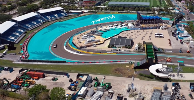
It’s hard to hide Miami and the beauty of an international city. But this track layout did a wonderful job of it.
Art Deco styling defines Miami but it was ignored in this track layout. There’s nothing that says Miami that I saw.
Several NASCAR drivers have said racing at Bristol was like flying fighter jets in a gymnasium. The Miami Grand Prix is like flying fighter jets in a Crypto dumpster filled with discarded Red Bull.
There doesn’t appear to be any rhythm between the bob-and-weave curbs and turns and the long boring straights.
And setting up beside one of the planet’s great oceans only to paint a marina on a parking lot; That left a little to be desired as well.
I saw a headline somewhere as I bumped around the ‘Net this week. It said America might find it hard to meet the needs of three Grand Prix races in one season.
Laying out a street race is tough but, looking at what happened at Miami, that might be true.
Peace.
 Studios | Sunday 7 – 9 PST
